Squamish Chamber of Commerce

2025 Brand Refresh

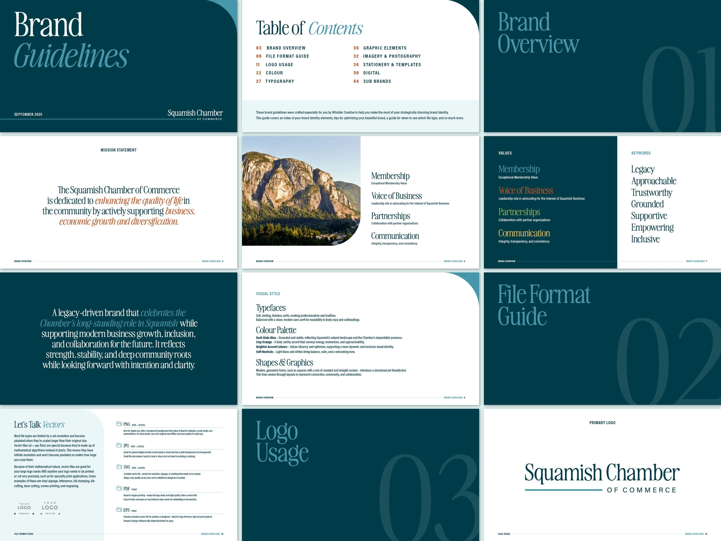
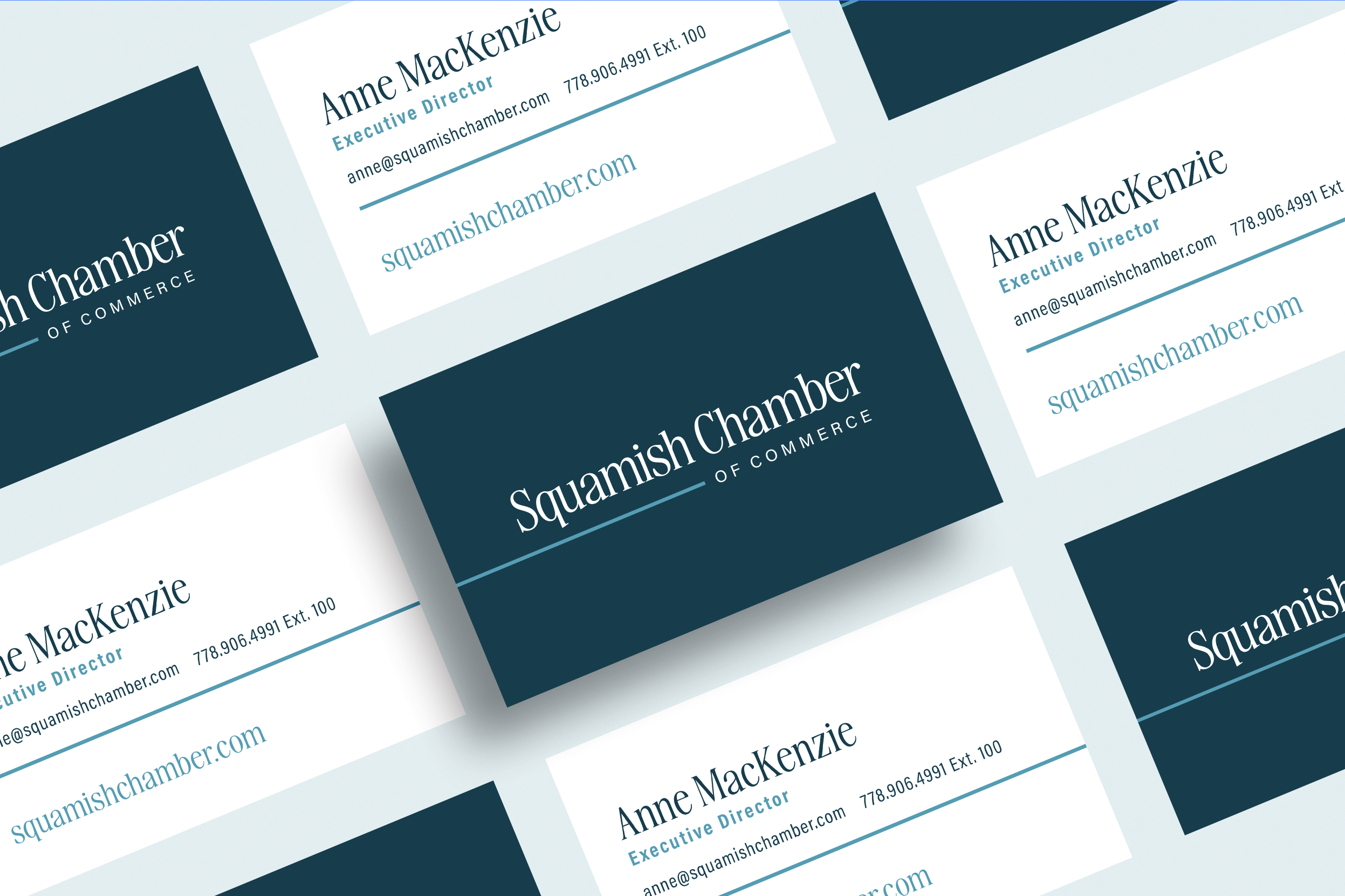
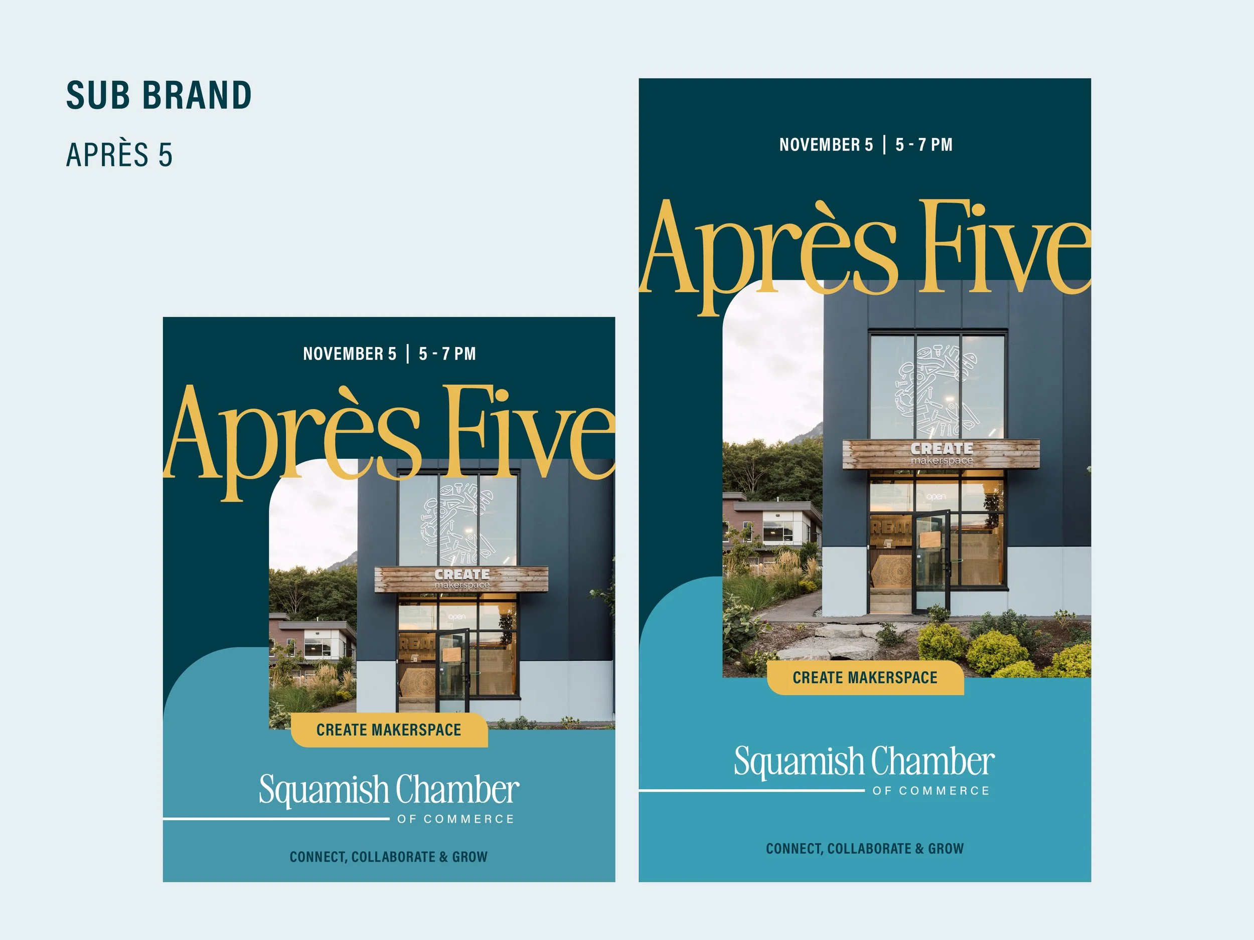
The Squamish Chamber of Commerce exists to support local businesses and strengthen the community. This refreshed brand honours the Chamber’s long-standing presence in Squamish while embracing a more modern, inclusive, and forward-looking approach. Rooted in the town’s natural landscape and strong sense of connection, the identity balances stability with momentum—reflecting where the Chamber has been and where it’s headed. Scope of work included full brand development, from logo design and visual identity to social media templates, ad creative, and sub-brand systems.

View Squamish Chamber of Commerce Website

This project was created during employment at Whistler Creative. All rights are retained by Whistler Creative.

Typography
A soft, timeless serif brings warmth, professionalism, and a sense of heritage. This is paired with a clean, modern sans serif to keep layouts feeling fresh, approachable, and easy to read across digital and print applications.

Colour Palette
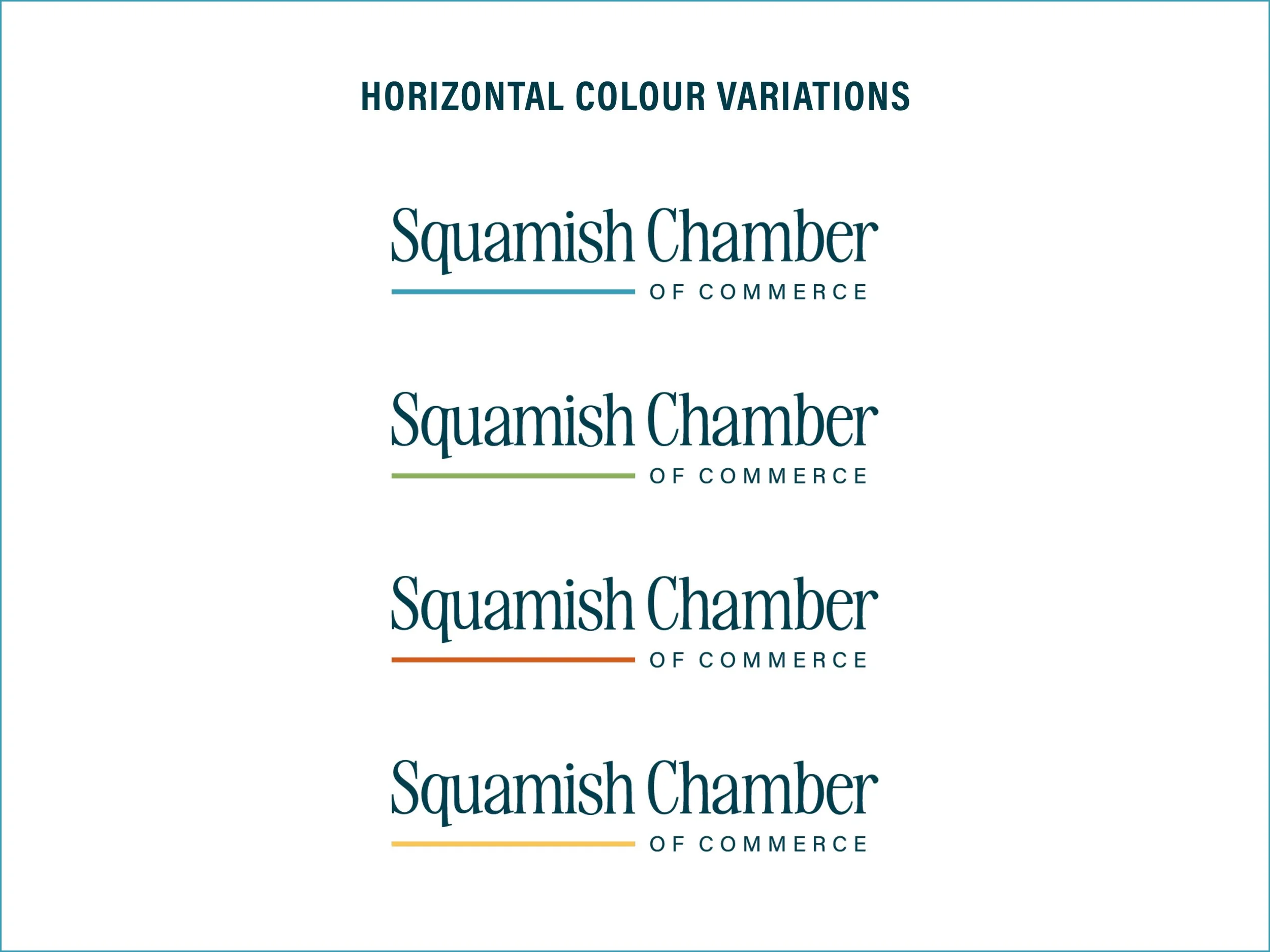
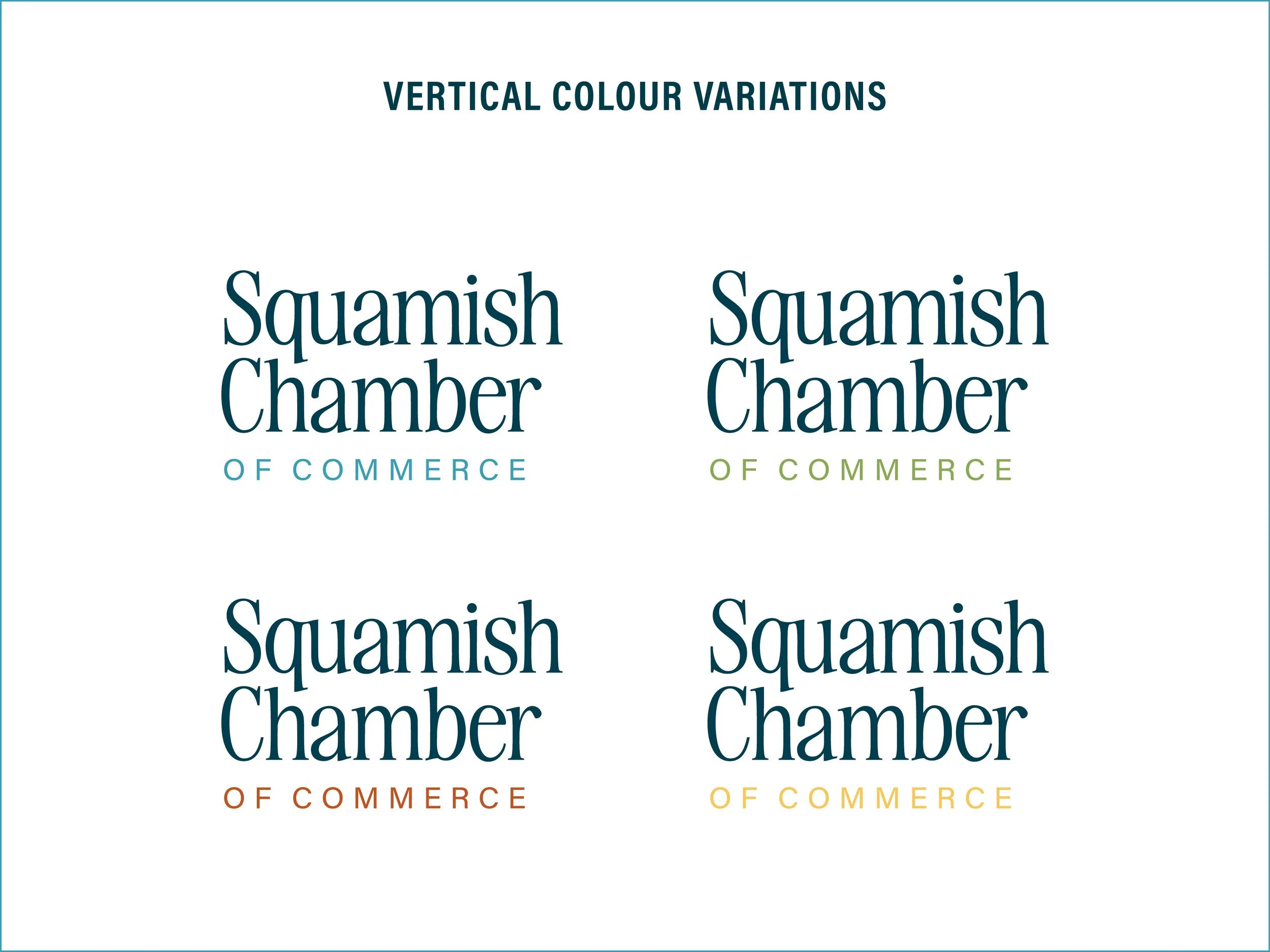
Dark Slate Blue grounds the brand, inspired by Squamish’s natural surroundings and the Chamber’s steady, dependable role.
Clay Orange adds warmth and energy, introducing a sense of optimism and approachability.
Brighter accent colours bring vibrancy and flexibility, helping the brand feel dynamic and inclusive.
Soft neutrals, including light blues and whites, balance the palette and create a calm, welcoming foundation.

Shapes & Graphics
Simple geometric forms - primarily squares with a mix of rounded and straight corners - add structure while maintaining a friendly, modern feel. Thin line work is used throughout layouts to subtly represent connection, collaboration, and the relationships that support a thriving local business community.

Next
Next

West Vancouver Community Foundation