West Vancouver Community Foundation

2025 Brand Refresh

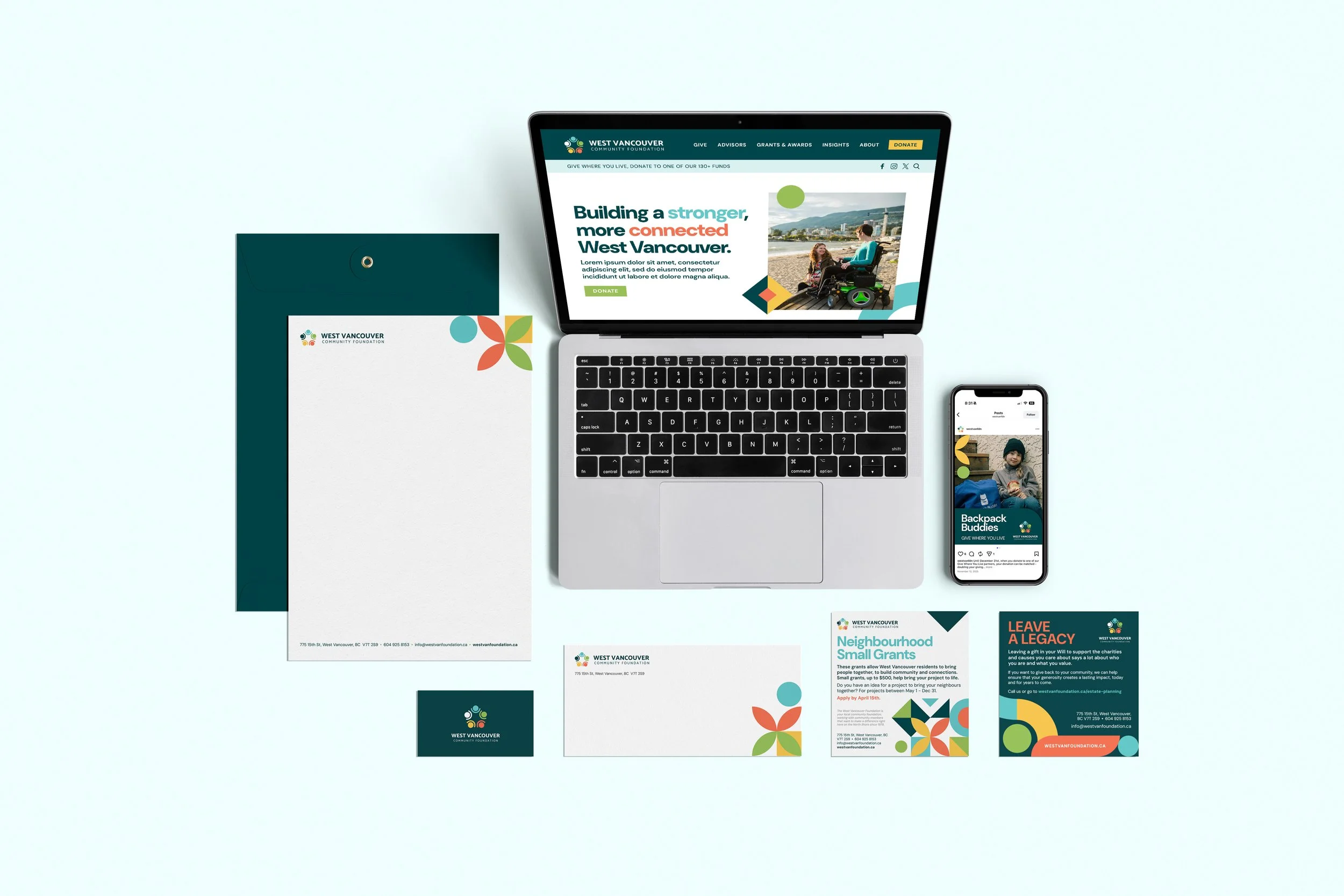
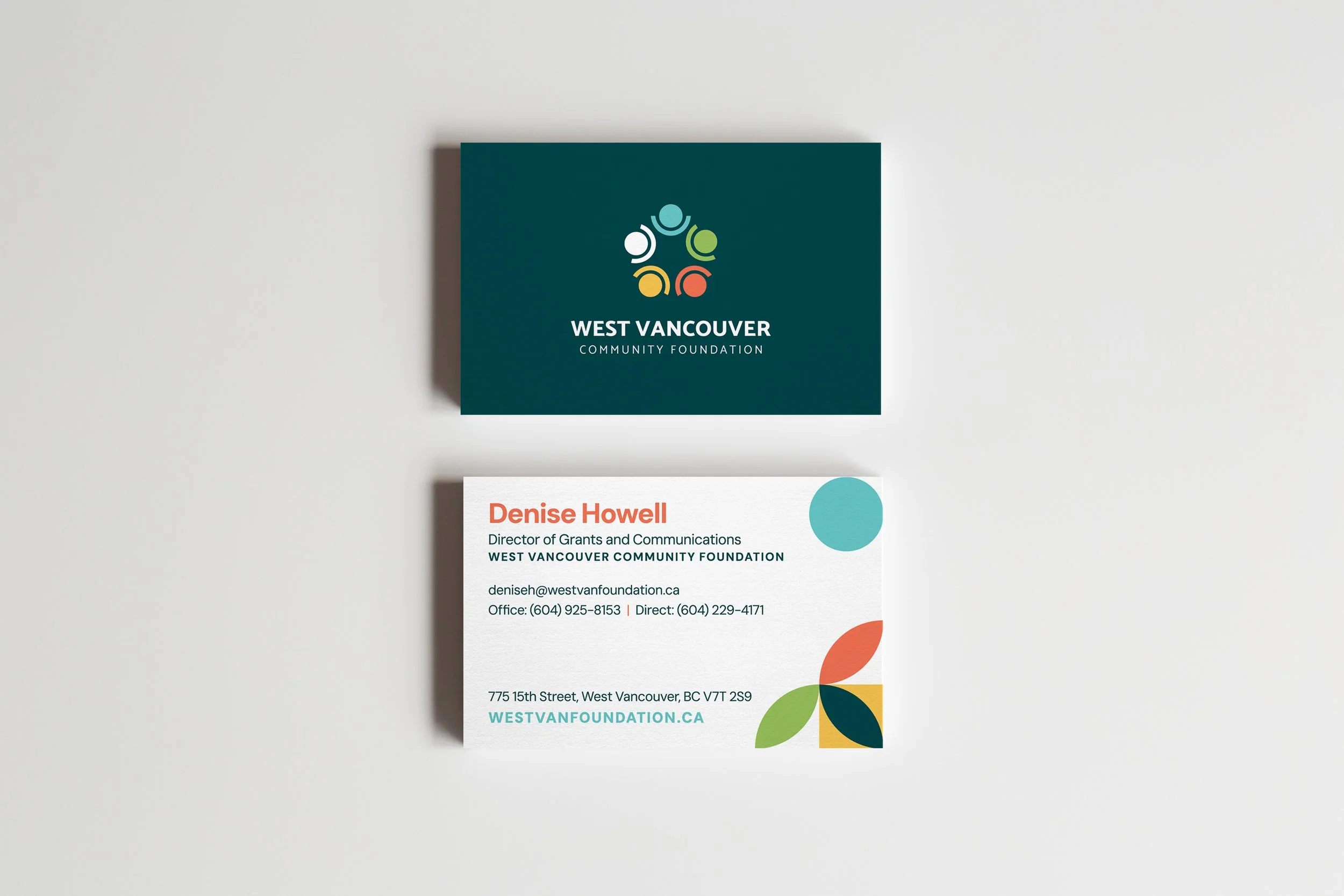
Building on the Foundation’s recognizable “people in a circle” icon, the refreshed identity reinforces values of community, connection, and inclusiveness. The logo was simplified and refined to feel more contemporary while preserving established brand equity. Updated colours and modern typography create a polished, cohesive system that is both welcoming and enduring. Scope of work included full brand development, from logo design and visual identity to social media templates, ad templates.

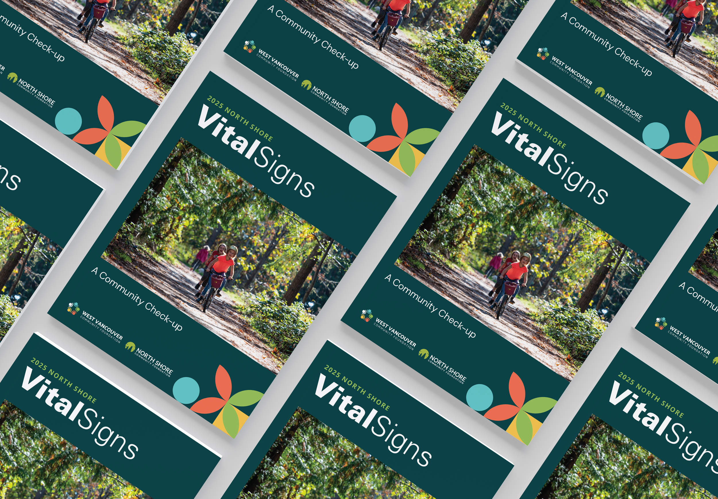
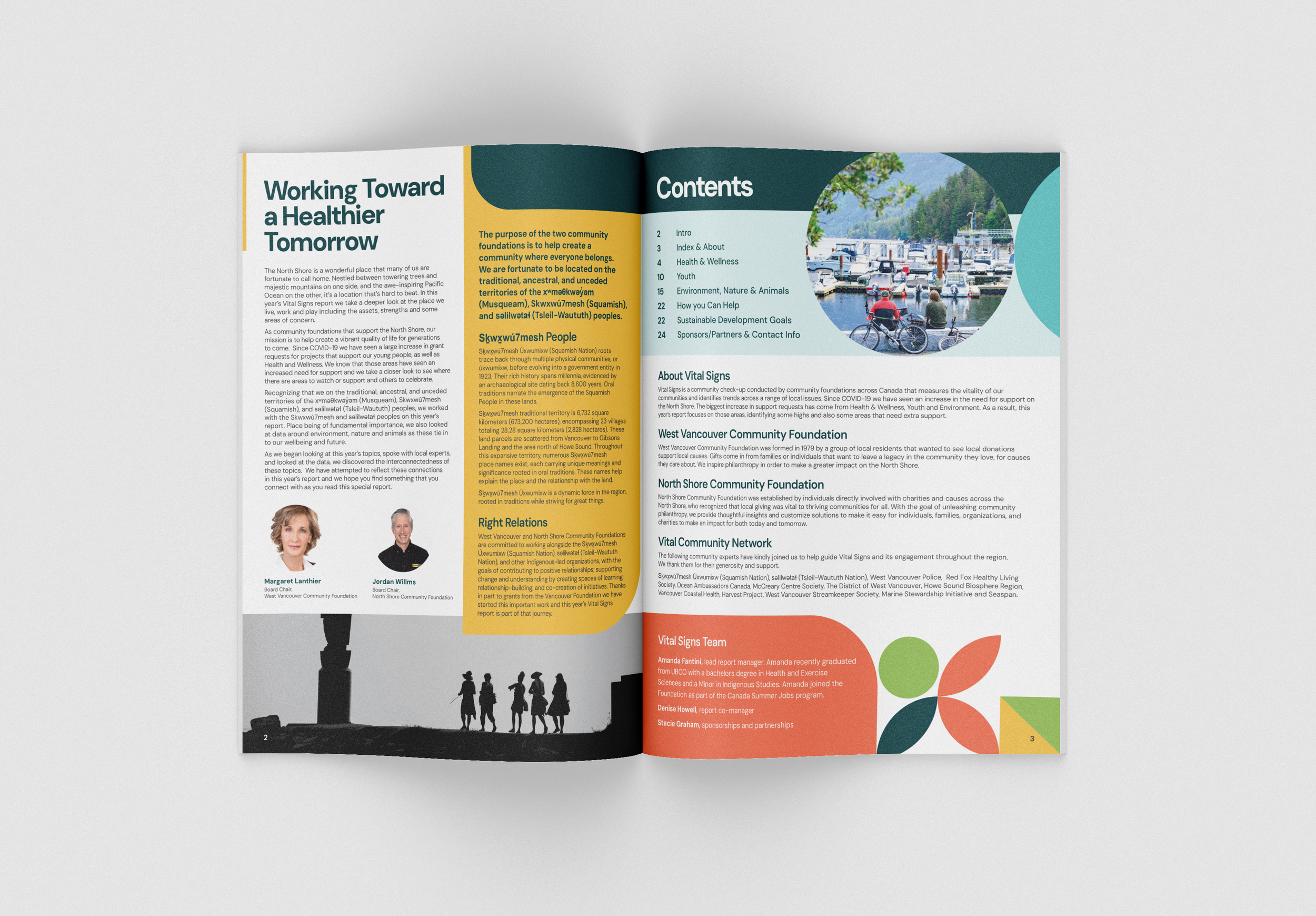
View the WVCF 2025 Vital Signs Report

This project was created during employment at Whistler Creative. All rights are retained by Whistler Creative.

Typography
DM Sans is used across the entire brand system for consistency and clarity. Its clean, modern forms support accessibility and legibility while maintaining a friendly, approachable tone suitable for both digital and print applications.

Colour Palette
The original vibrant palette was refreshed and softened to feel more modern and versatile. A diverse range of colours supports representation and flexibility across communications, while avoiding overly bright tones that can feel dated.

Shapes & Graphics
The circular icon remains the core visual element of the brand. Simplified forms enhance versatility and scalability, while supporting graphics echo the circular motif to reinforce themes of unity, inclusivity, and connection.

The West Vancouver Community Foundation website was designed to clearly communicate impact while guiding users toward meaningful action. A clean, modular layout establishes strong hierarchy, making it easy to explore ways to give, understand community impact, and navigate key information.

The design balances storytelling with functionality, using concise messaging, clear calls to action, and impact-driven statistics to build trust and encourage engagement. Visually, the site aligns with the refreshed brand through consistent use of typography, colour palette, and graphics that reinforce community and connection. Accessibility and scalability were key considerations, ensuring a welcoming, flexible experience across devices.

Previous
Previous

Squamish Chamber of Commerce

Next
Next

Whistler Olympic Park